Finding Your Color Confidence with Wendy Langston of Everything Home Designs
Luxury interiors, do you go bold or stick with neutrals? Or maybe you're somewhere in the middle, wondering if that custom painted island you've been eyeing is a brilliant statement or a Pinterest trap. We sat down with Wendy Langston, founder and CEO of Everything Home Designs, to chat all things color, confidence, and creating high-end interiors that actually feel like home. Spoiler alert: whether you're going bold or keeping it classic, it's all about intention.
What’s the Real Difference of Bold vs. Neutral?
According to Wendy, it’s not just about color. It's about personality.
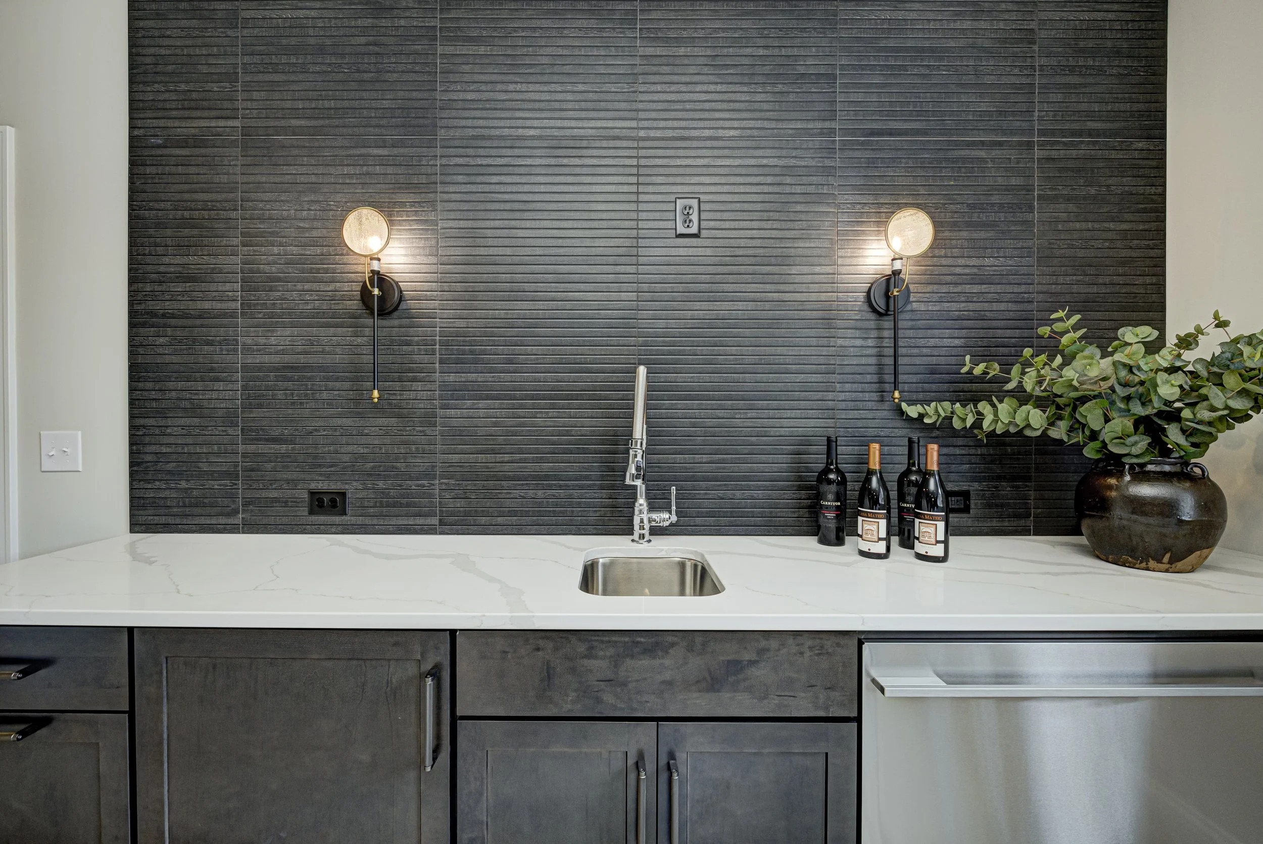
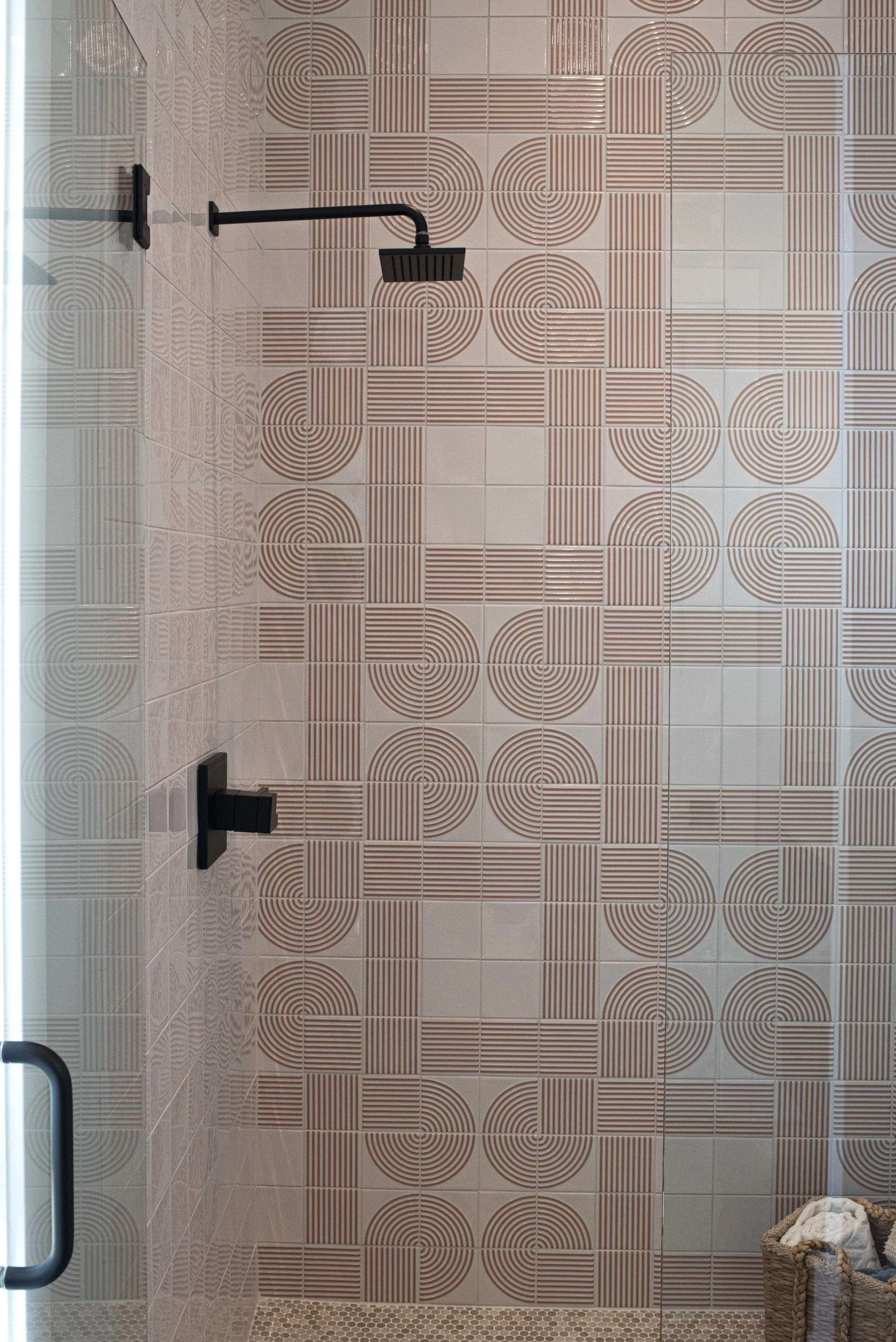
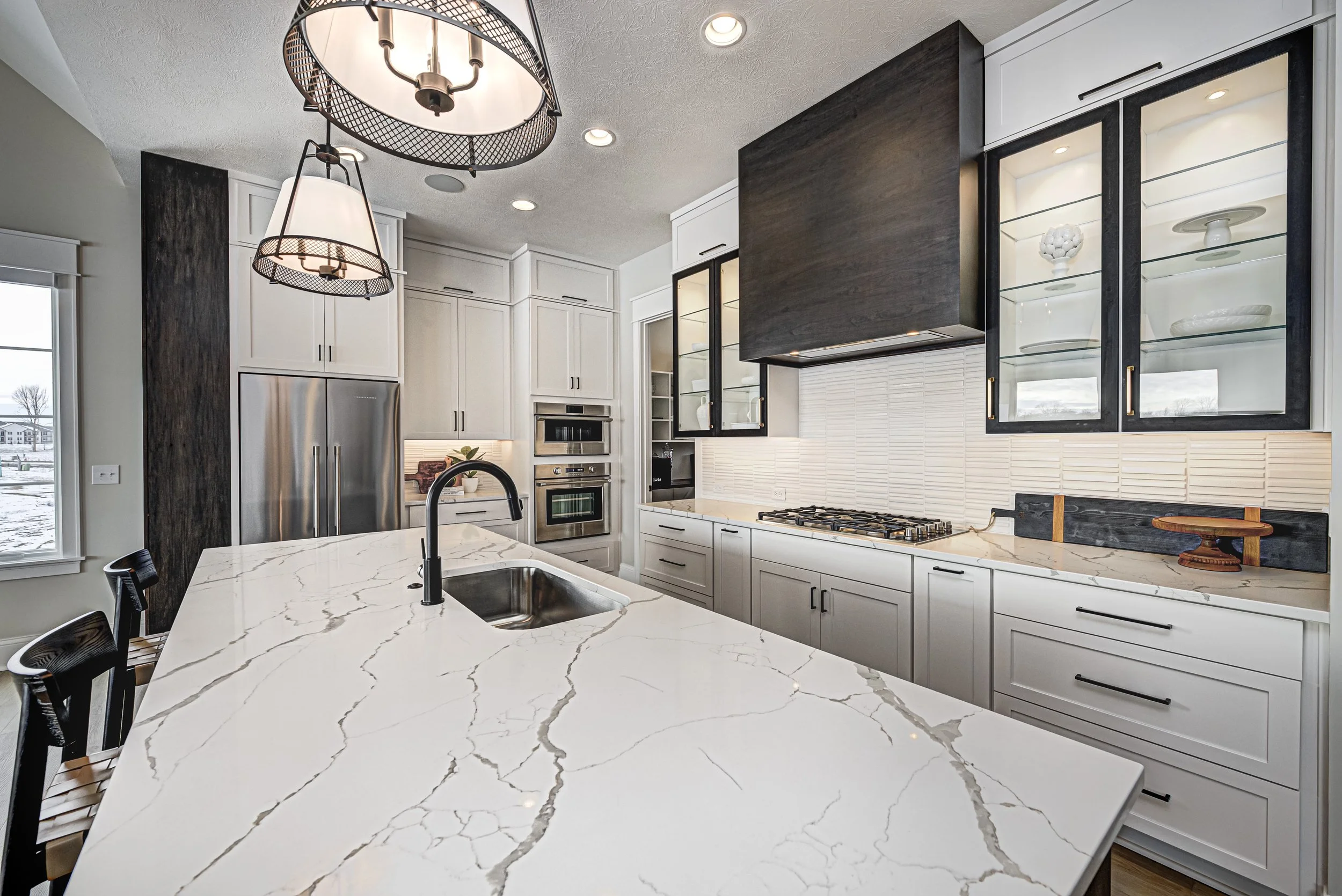
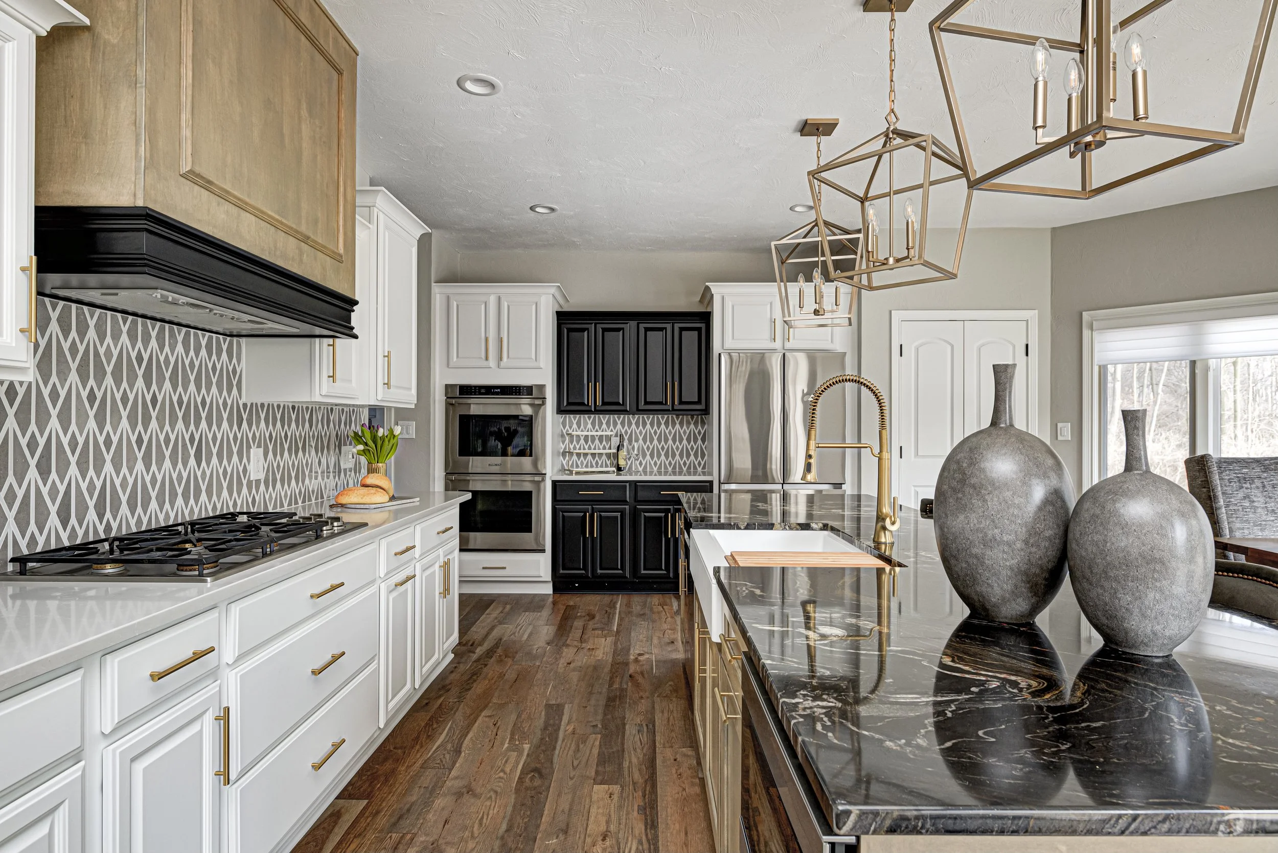
“We define bold as intentional, expressive choices that create visual drama. Think deep emerald cabinetry, statement lighting, or richly veined marble,” she says. “Neutral is timeless elegance—layered textures, soft palettes, and architectural detail that speaks quietly but confidently.”
In other words, bold doesn’t mean wild, and neutral doesn’t mean boring. It’s all about the vibe you’re creating, and the feeling that you’re trying to capture.
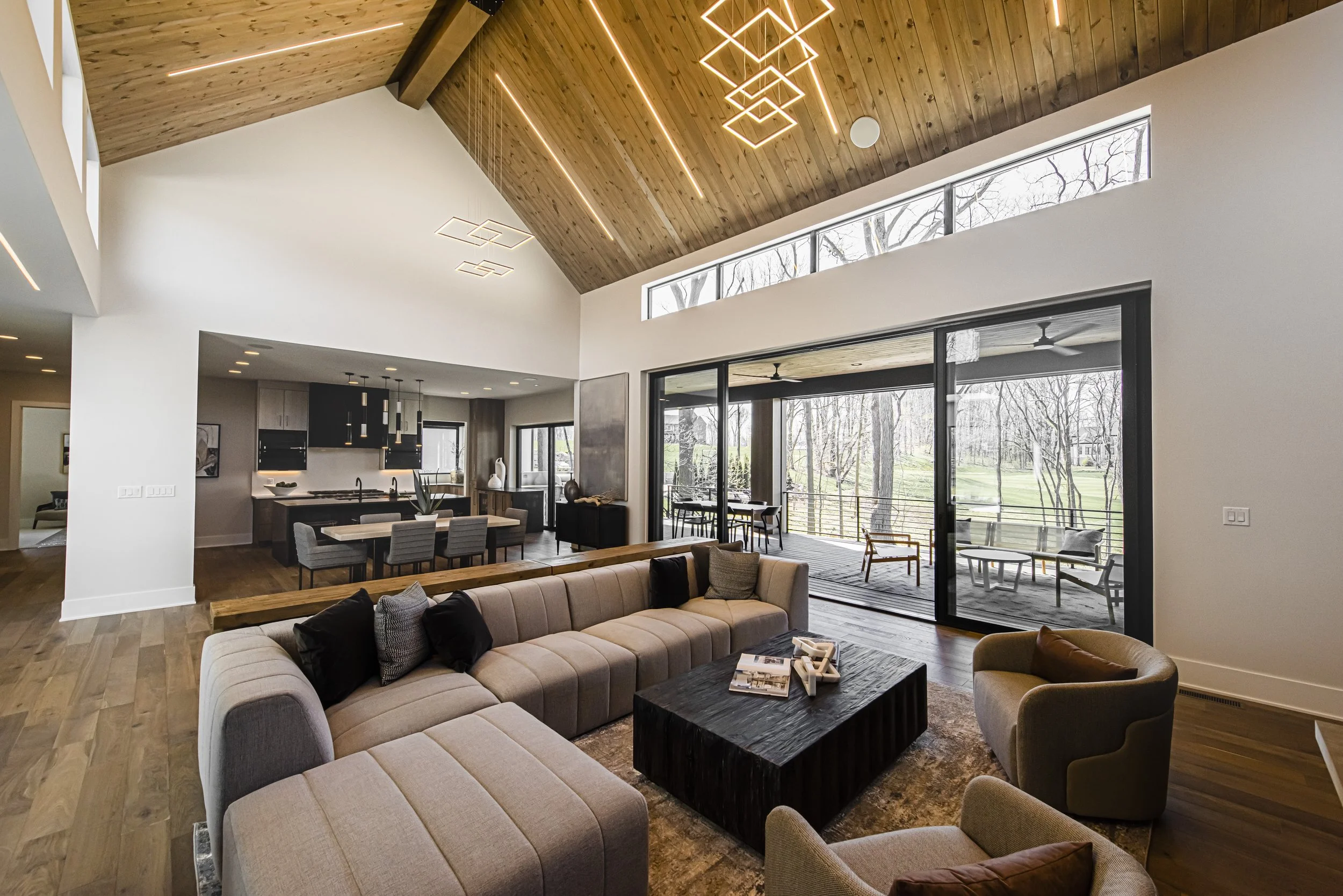
The Power of Color in Luxury Design
Color is more than the finishing touch. It sets the emotional tone of the entire room.
“In luxury interiors, color is experiential,” Wendy explains. “Whether it’s a moody charcoal library or a serene ivory bedroom, color shapes how a space feels, functions, and flows.”
Before you even notice the furniture or the finishes, the color is already speaking to you.
What Are Clients Choosing?
Goodbye, beige-only everything!
“Clients are still loving their neutrals,” Wendy admits, “but they’re also becoming more open to bold accents in spaces like kitchens, powder rooms, and home offices.”
The pandemic shook up how we use our homes, and now people want spaces that feel personal, expressive, and maybe even a little daring.
How Wendy Guides Clients Through Color Choices
Not everyone walks into a showroom and declares, “Give me the navy velvet sofa!” That’s where Everything Home Designs’ signature approach comes in.
We start with the client’s lifestyle and emotional goals, then add layers of visual inspiration and tactile materials.
“Our three Core Services: The Signature, The Exclusive, and The Blue Print let us tailor the process to each client,” she says. “We often introduce boldness through art, textiles, or millwork, so it’s both impactful and flexible.”
Translation: bold doesn’t have to mean permanent.
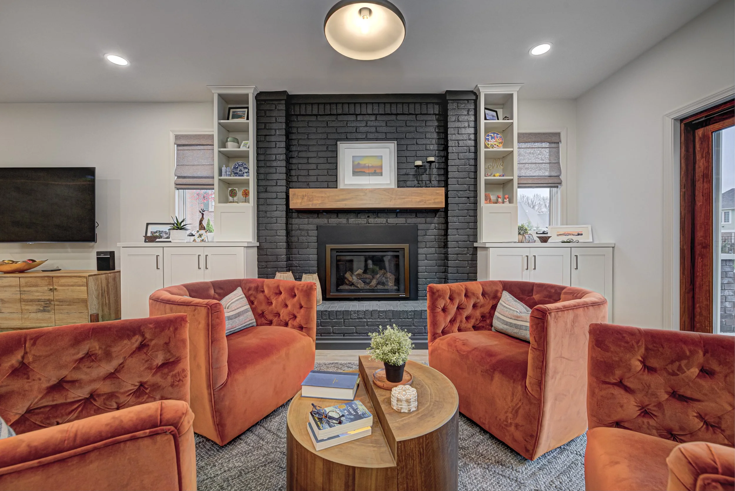
Go-To Color Combos We’re Loving

Wendy’s current palette crushes?
Warm neutrals like mushroom or greige, paired with navy, forest green, or terracotta.
Creamy whites with matte black and brass.
These combos feel grounded and luxe without trying too hard. (Is that not the dream?)
Biggest Mistakes with Bold or Neutral Palettes
If you’ve ever walked into a room that made your eyes hurt or made you yawn, you’ve seen what happens when bold or neutral goes off the rails.
“Too many saturated tones can overwhelm,” Wendy says. “And with neutrals, not enough texture or contrast makes the space feel flat.”
Balance is key. And professional guidance? Even better.
Where to Go Bold vs. Where to Keep It Cool
Ready to spice things up? Powder rooms, dining rooms, and offices are great spots for bold moves. These are high-impact, low-commitment zones where drama is welcome.
Want something that stands the test of time? Keep your primary suite and main living spaces neutral and layered. You’ll thank yourself later when trends change but your space still feels just right.
What’s Next in Color for 2025?
Get ready for a little drama of the earthy, elevated kind.
“We’re loving jewel-toned earth colors: ochre, rust, deep teal - especially when paired with natural materials,” Wendy shares. “Monochromatic layering is also trending, where one hue is explored through texture and tone.”
It’s sophisticated, soulful, and perfect for adding richness without going overboard.
Whether you lean bold, neutral, or somewhere in between, Wendy Langston and the Everything Home Designs team are all about helping you find your color confidence and creating spaces that feel just as luxurious as they look.